data310_spring2021
Informal responses from March 10
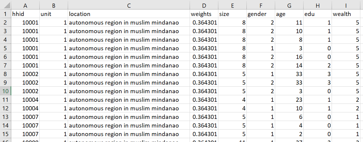
Import the households dataset for your selected country and create a data frame with a variable that describes each of the following: household ID, unit, weights, location, size, gender, age, education, wealth
output:

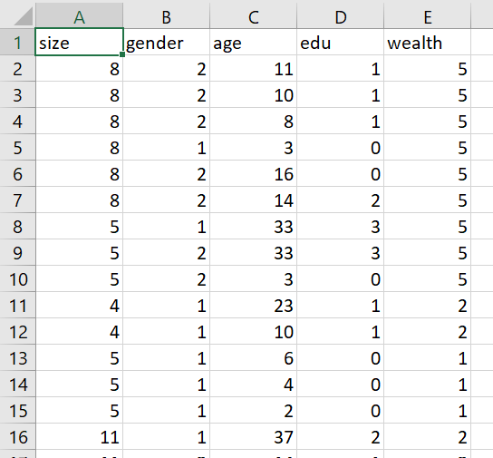
Pivot the persons columns within your households data to a long format in order to produce a similarly specified dataset that describes all persons residing within all households. Using this data frame describing all persons standardize, normalize and percentize your variables and visualize each post transformed dataset as a heatmap that illustrates the heterogeneity of the combination of patterns.
- pns dataframe:

- I scaled, normalized, and percentized the pns dataframe using the following code. For this heatmap function to work, I had to convert all the columns to numeric, so I made a pnscopy dataframe where everything was numeric, and then scaled, normalized, and percentized the data.
pnscopy = pns
pnscopy$size <- as.numeric(pnscopy$size)
pnscopy$gender <- as.numeric(pnscopy$gender)
pnscopy$age <- as.numeric(pnscopy$age)
pnscopy$edu <- as.numeric(pnscopy$edu)
pnscopy$wealth <- as.numeric(pnscopy$wealth)
pnscopy = scale(pnscopy)
pnscopy = normalize(pnscopy)
pnscopy = percentize(pnscopy)
which produced the following dataframe:

-
Heatmaps in progress, having issues with heatmaply
-
Still can’t get heatmaply to work, still getting the following error despite trying Caroline’s workaround:
Error in hclustfun(dist) : must have n >= 2 objects to cluster
- I instead tried to create the heatmap of the scaled, normalized, and percentized data using the basic heatmap function in R:
pns_prep2 <- slice_sample(pnscopy, n = 1000, replace = FALSE)
pns_matrix2 <- data.matrix(pns_prep2)
pns_heatmap2 <- heatmap(pns_matrix2, Rowv=NA, Colv=NA,
                       col = cm.colors(256), scale="column", margins=c(5,10))
png(file = "./DHS/pns_heatmap2.png")
heatmap(pns_matrix2)
dev.off()
which produced the following plot:

After trying that workaround, I tried running the heatmaply function on the pnscopy dataframe, where all columns were numeric. The heatmaply functions then worked correctly, and created the following plots (which seem to be so large that the axis labels are unreadable):
raw:

scaled:

normalized:

percentized:
